Didem Tereyagoglu


TAO Teknoloji / TAO Technology
Brand Identity Design
TAO Teknoloji demanded more than a visual identity — it needed a belief system in design form. This project began by asking a fundamental question: What if technology had a reason? The result is a branding ecosystem that reflects the emotional, cognitive, and coded layers of modern innovation. TAO operates in the AI and tech space, but unlike its competitors, it leads with philosophy and poetic logic.
The logo design is a custom typographic glyph — a symbolic system where each letter (T, A, and O) is abstracted and reassembled into a singular form. The dot of the “O” becomes a pulse, a voice, or even a sun. The arc of the “A” mimics both signal waves and human expression. The vertical of the “T” acts as anchor, representing clarity and balance. Together, they form a visual language that feels algorithmic yet deeply human.
TAO is named after the Taoist principle of natural order, fluidity, and interconnection. Just as the Tao flows and balances the universe, TAO Teknoloji flows with purpose through the chaotic noise of the tech industry, offering clarity, ethics, and grounded intelligence.
The visual identity of TAO is built around controlled abstraction. Gradients in deep coral, midnight teal, and ivory evoke both emotional warmth and technological complexity. These colors aren’t random trends; they were carefully chosen based on industry research and tech brand semiotics. They mimic the neural glow of AI-generated responses, voice modulations, and sonic feedback waves—mirroring the way we speak to technology and receive answers.
Each piece of the brand—from its logo to its stationery—is built on this idea of dialogue. TAO does not scream. It listens. The logo itself is a symbolic glyph—an almost linguistic emblem, as if it was plucked from a code-based alphabet of the future. We do not just design visuals. We design a new syntax for understanding intelligence.
Precise. Calm. Curious. TAO’s tone is not promotional, but reflective. We invite, rather than instruct. TAO's written and spoken language mimics a gentle prompt: the question before the code, the breath before the algorithm.
Communication System
-
Voice-controlled UX patterns
-
Gradients that react to dialogue
-
Text-based responses integrated into visual waves
-
Content built for intelligent questioning, not linear pushing
Visual Output Includes
-
Corporate stationery (letterhead, cards, envelopes, mobile UI)
-
Urban branding (billboards, signage)
-
UI logic that acts like a human conversation
-
TAO speaks to thought-leaders, tech developers, design thinkers, and founders who believe that innovation must be guided by intent. It is not enough to move fast. You must move with reason.
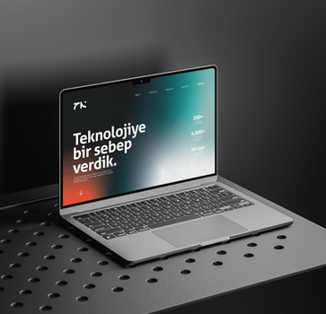
“Teknolojiye bir sebep verdik.” (We gave technology a reason.)
More than a slogan, this line reframes the entire industry mindset. TAO doesn’t sell features — it offers purpose. The message speaks to curious engineers, ethical investors, and future-minded collaborators alike.This is not just a brand. TAO is a signal in the noise — a voice for meaningful innovation. The design reflects a new syntax of tech branding: clean, emotive, code-aware, and culturally resonant.


