Didem Tereyagoglu


Conterp – Brazil
Logo & Full Brand Identity Design
Conterp is a Brazilian engineering and energy company specializing in on-site services, petroleum systems, and infrastructure. When I began this branding project, the goal was to craft a modern, instantly recognizable identity that could reflect both the robust nature of the energy industry and Conterp’s commitment to innovation.
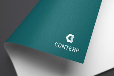
I designed a complete brand identity system from scratch—including logo, business cards, internal and external branding materials, and even oilfield uniforms. The logo is built from modular geometric shapes forming a stylized “C,” symbolizing structure, progress, and precision—qualities essential in energy operations. This shape also mirrors an industrial hex nut, reinforcing their engineering core.
From stationery to lanyards to billboards across Brazil, the system was designed to work across digital and physical spaces with a consistent, clean, and professional visual tone. I'm proud to see Conterp still using the logo and identity to this day.
Precision, trust, and progress.
Energize your operations with a brand that reflects your engineering excellence.Conterp’s identity helped them present themselves as reliable, cutting-edge, and well-aligned with their mission to power and support Brazil’s infrastructure.
-
Develop a logo that felt technical yet clean, flexible across formats and languages.
-
Create a scalable brand identity system that could adapt to site uniforms, documents, signage, and digital platforms.
-
Position Conterp as a trustworthy, energetic, and forward-thinking company in the industrial energy space.
-
-
No consistent visual identity existed—internal and external assets lacked coherence.
-
Need for a bilingual and visually functional brand across both professional and physical materials, including outdoor equipment.
-
Must feel modern and authoritative without losing approachability.
-
-
Designed a modular logo that continues to be used today across the company’s platforms.
-
Built a cohesive visual system adopted across uniforms, documents, and site materials.
-
Delivered a clean, tech-inspired brand language that communicated professionalism and adaptability.
-
Created a design that unified the brand presence for employees, clients, and stakeholders alike.
-


